

Produce Company Rebrand Design
Deliverables
1 Logo
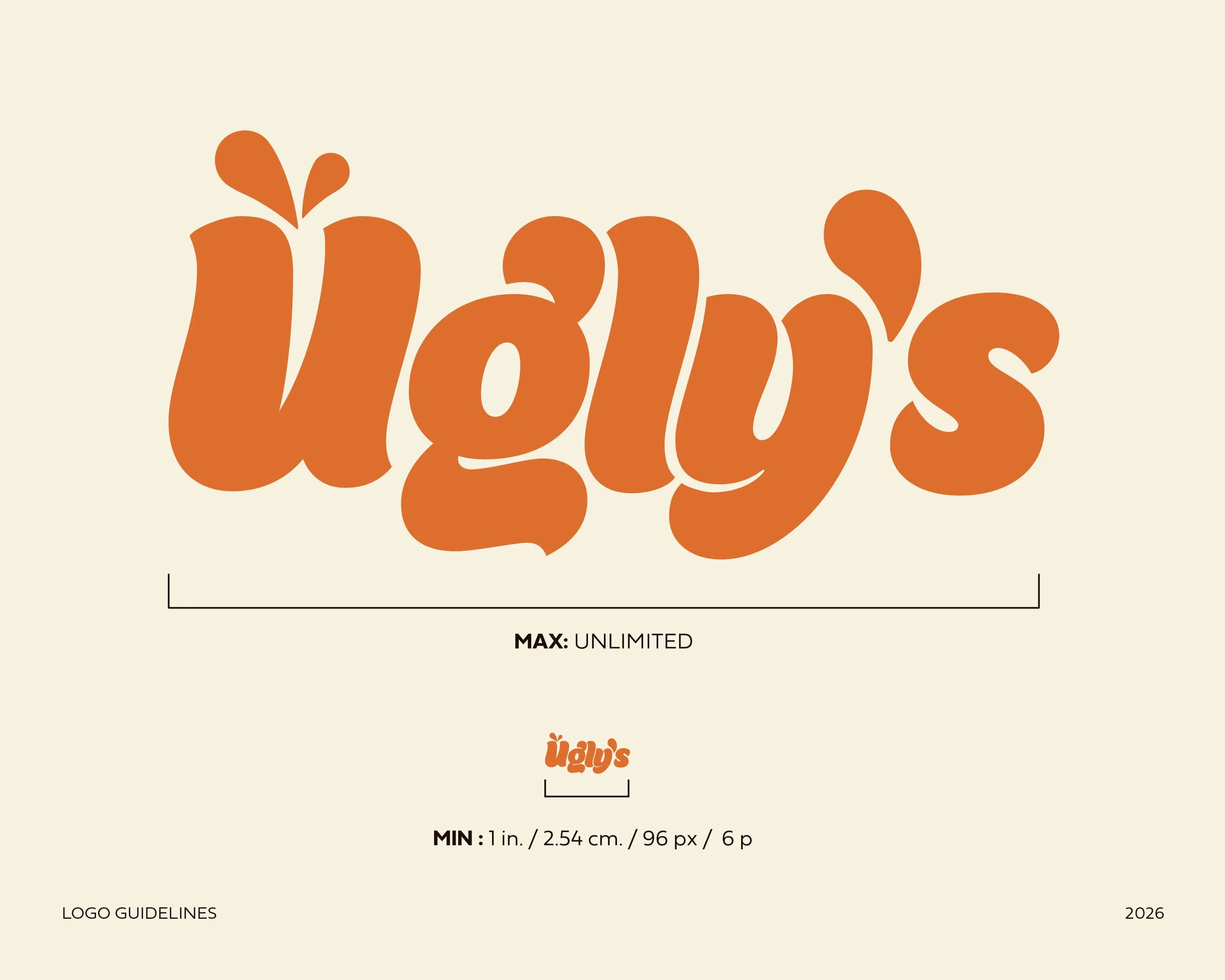
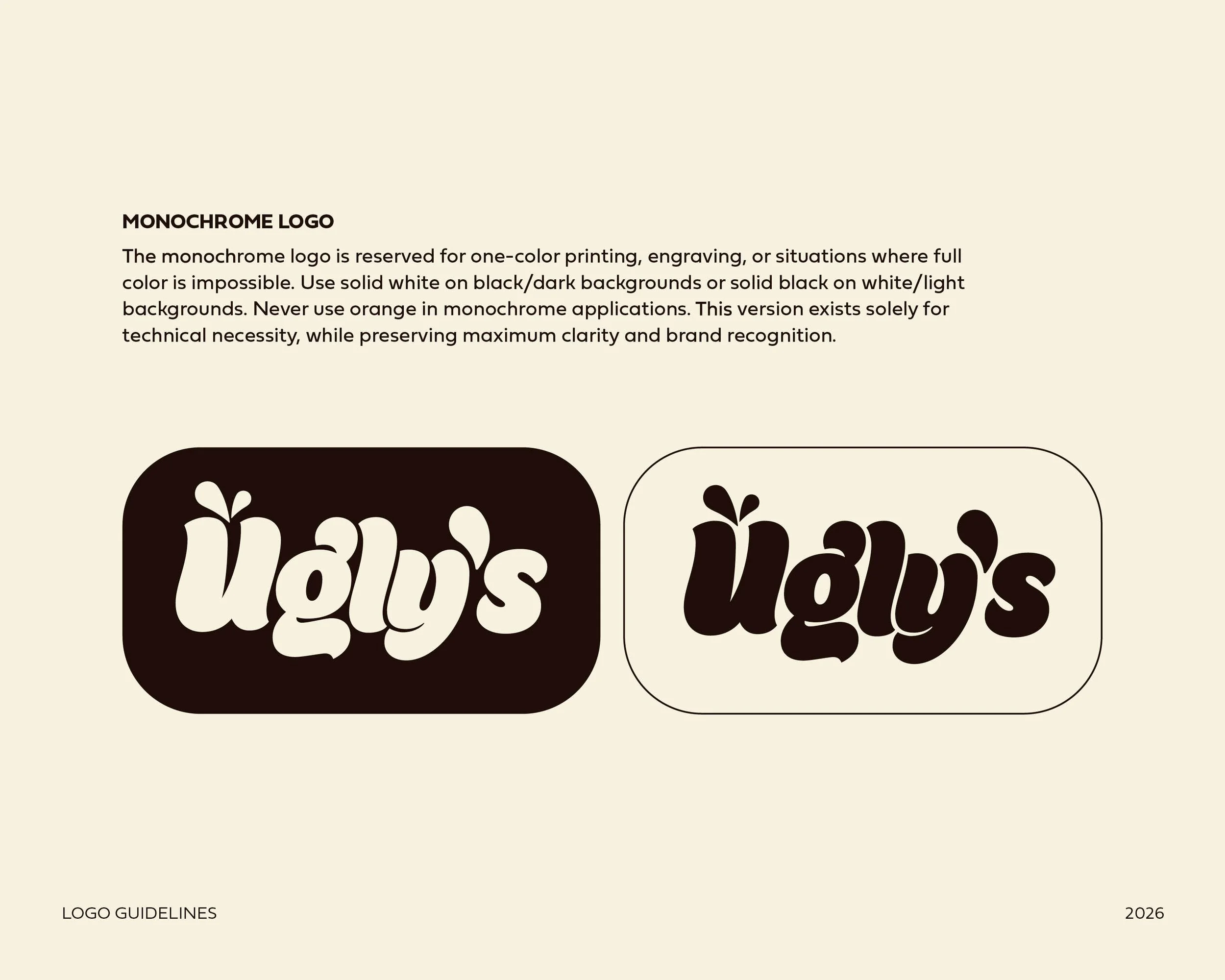
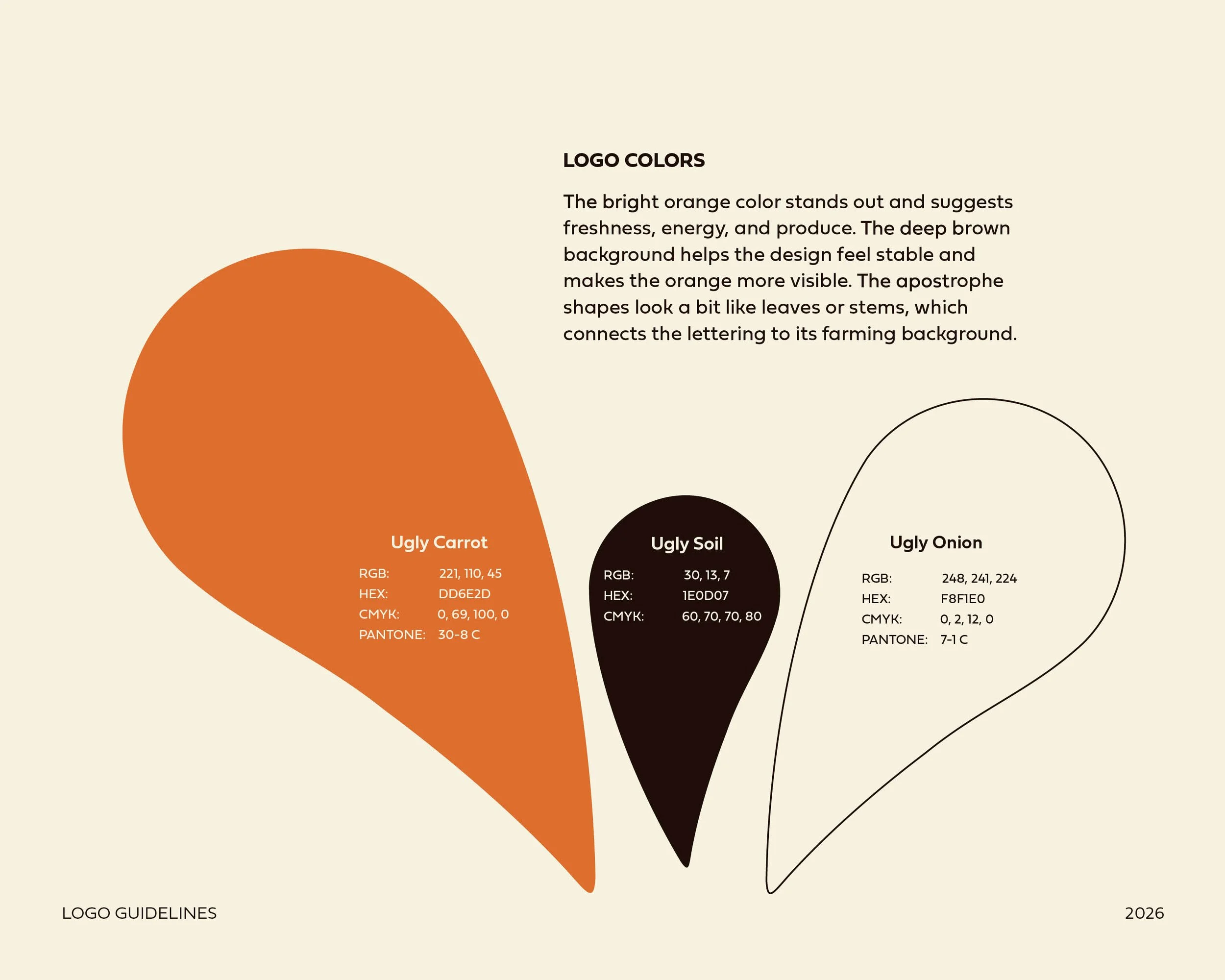
1 logo guideline
1 Website
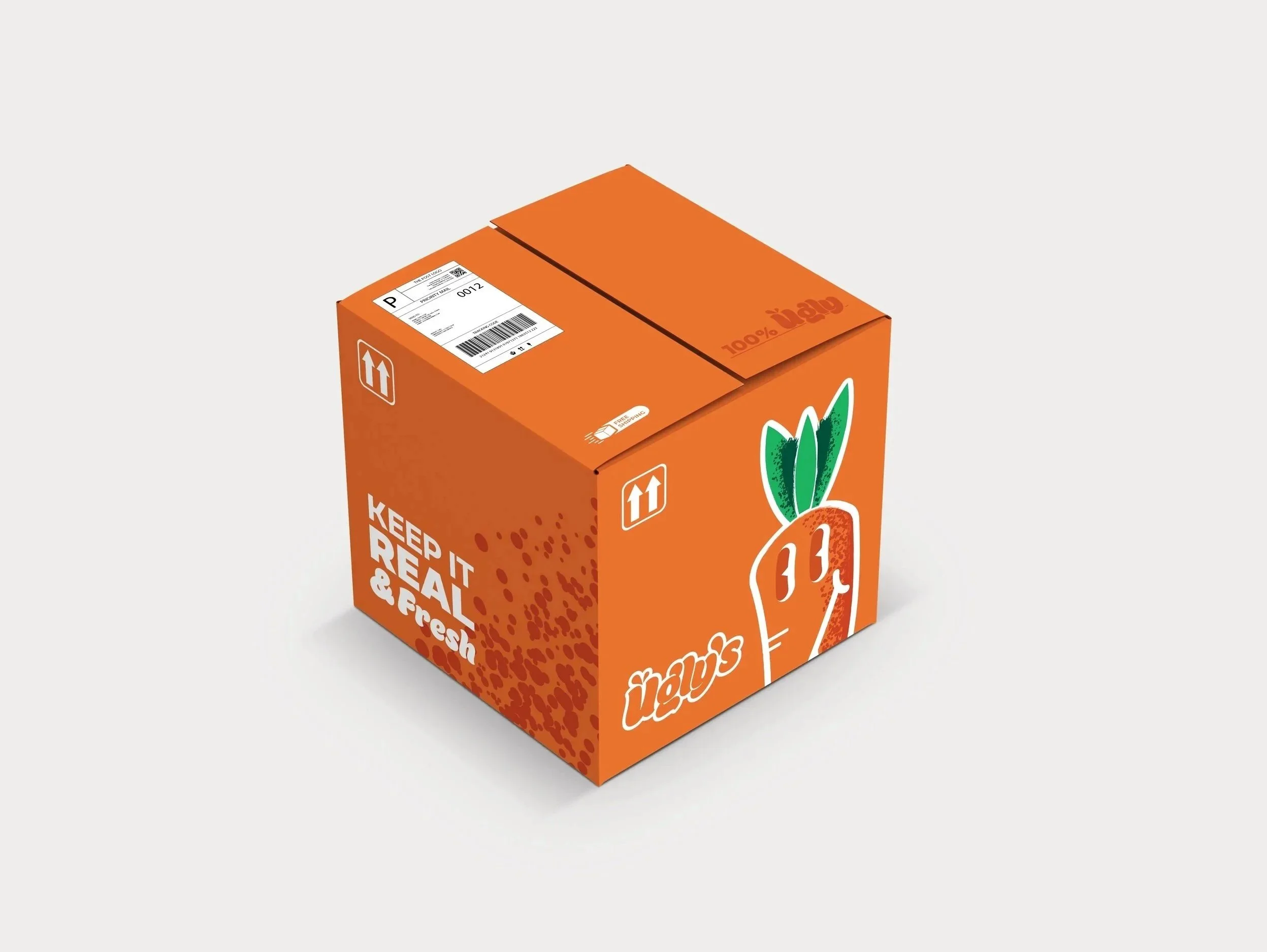
1 Delivery box
4 Thank you cards
3 Stickers
1 bag
3 Poster Ads
Tools
Adobe Illustrator
Adobe Photoshop
Figma
Procreate
Proposal
Billions of pounds of high-quality food are thrown away by local grocery stores to ensure they only sell produce that looks perfect for consumers. Ugly’s Produce Company is an online produce store with a mission to challenge traditional grocery standards and change how people see fresh food. Ugly’s believes it’s important to look beyond appearance and make better healthy choices. The Ugly’s Produce Company wants to build an approachable brand that shows imperfect produce is honest, nutritious, and valuable. By doing this, Ugly’s Produce hopes to help reduce food waste and make fresh food available to everyone. Ugly’s Produce puts community first to ensure everyone has access to nutritious food. In the U.S., 1 in 7 people face hunger, and one-third of all U.S. food is wasted. That’s why Ugly’s produce partners with 60+ organizations nationwide to fight hunger and improve food access everywhere. - Real food for a better world.
Ugly’s Produce Company makes it easy to order nutritious, ugly, fresh produce online and have it delivered right to your door. Customers can use the Ugly’s website to order high-quality fruits and vegetables, with each shipment box including a free Ugly’s sticker and a thank-you card from our farmers, and a little info about where your food came from. Ugly’s produce also offers reusable mystery grocery bags to add a fun surprise when shopping online. Ugly’s also offers a subscription option that delivers a supply of fresh produce to customers' doors each week. The Ugly’s company approach helps individuals and families get affordable, healthy food without the stress of in-person shopping, making it easier to shop thoughtfully.
Ugly’s Produce Company is marketed toward budget-conscious consumers, students, and environmentally aware individuals who value affordability and sustainability. While this is the primary target demographic, Ugly’s produce is for everyone, and all ages can enjoy the same fresh, high-quality produce regardless of appearance.
Company Profile
Ugly's Produce Company turns "flaws into flavor" rather than disposal. Giving the fruits and vegetables that look less perfect a second chance the company challenges common supermarket conceptions of what produces the best flavor, but this "ugly" produce does not disappoint. With bright and playful branding, Ugly's Produce asks customers to consider the possibility of re-thinking what it means to be quality while actively contributing to reducing the food wasted each year.
Ugly's is devoted to providing fresh, perfectly edible, and nutritious fruits and vegetables that do not have the "beauty contest" standard found in standard grocery stores. The produce comes in bright and humorous packaging that highlights what makes each fruit or vegetable unique; the product's features become the "unique selling propositions." The company also sells eco-friendly tote bags, fun branded items, and an online marketplace. This business seeks to give each customer a warm and cheerful and eco-friendly shopping experience.
Ugly's Produce caters to the eco-conscious consumers of the younger generation whose shopping interests revolve around values, sustainability, and humorous, distinct branding. While the core consumer base targets college students and young adults, the market extends to any who have the interest and the desire to shop more consciously, contribute to less waste, and to support brands who embrace the idea of beauty in uniqueness. Combining fun, a passion for education, and inventive marketing, Ugly's Produce stands out among other similar brand images while also encouraging viewers to adopt a broader view of beauty.
Ugly’s Produce Company sees imperfections as perfect taste rather than throwing them away. By giving “ugly” fruits and vegetables another shot, the company questions the usual grocery-store beauty standards. With a bold, playful style, Ugly’s Produce invites people to rethink what quality means and helps reduce food waste.
Objectives
To independently research, design, and produce logo guidelines, website, reusable grocery bags, a delivery box, three stickers, and three poster advertisements for Ugly’s Produce Company.
To research food chain systems, food waste, and branding practices to guide concept development and make sure Ugly’s Produce Company’s visual identity is accurate and authentic.
To apply foundational principles of graphic design, including typography, color theory, hierarchy, layout, and visual consistency when developing thumbnails, roughs, comps, and final designs for each deliverable.
To explore branding strategies, trends, and common challenges, and keep the brand consistent across different platforms.
To synthesize research, concept development, and design work to create a unified brand system. Connect packaging, print, and digital pieces with consistent typography, images, and messaging.
To comprehend feedback from peer critiques and instructor reviews, demonstrating the ability to revise, refine, and improve design solutions through an iterative design process.
To produce a cohesive and well-resolved final project presentation that reflects growth in problem-solving, conceptual thinking, and technical skills, while evaluating the challenges throughout the design process.
Target Audience
Ugly's Produce, which is about people that love to conserve the planet, mainly target at the youth as this generation really values genuineity, sustainability and strong brand image. Though the college students and young adults are the main market, any other consumers are also being lured if they care about avoiding waste, make responsible eating decisions. Through wit, education, and artful design, Ugly's Produce distinguish itself within the crowded similar looking brands and helps people realize new beauty in a totally different light.
Process Work
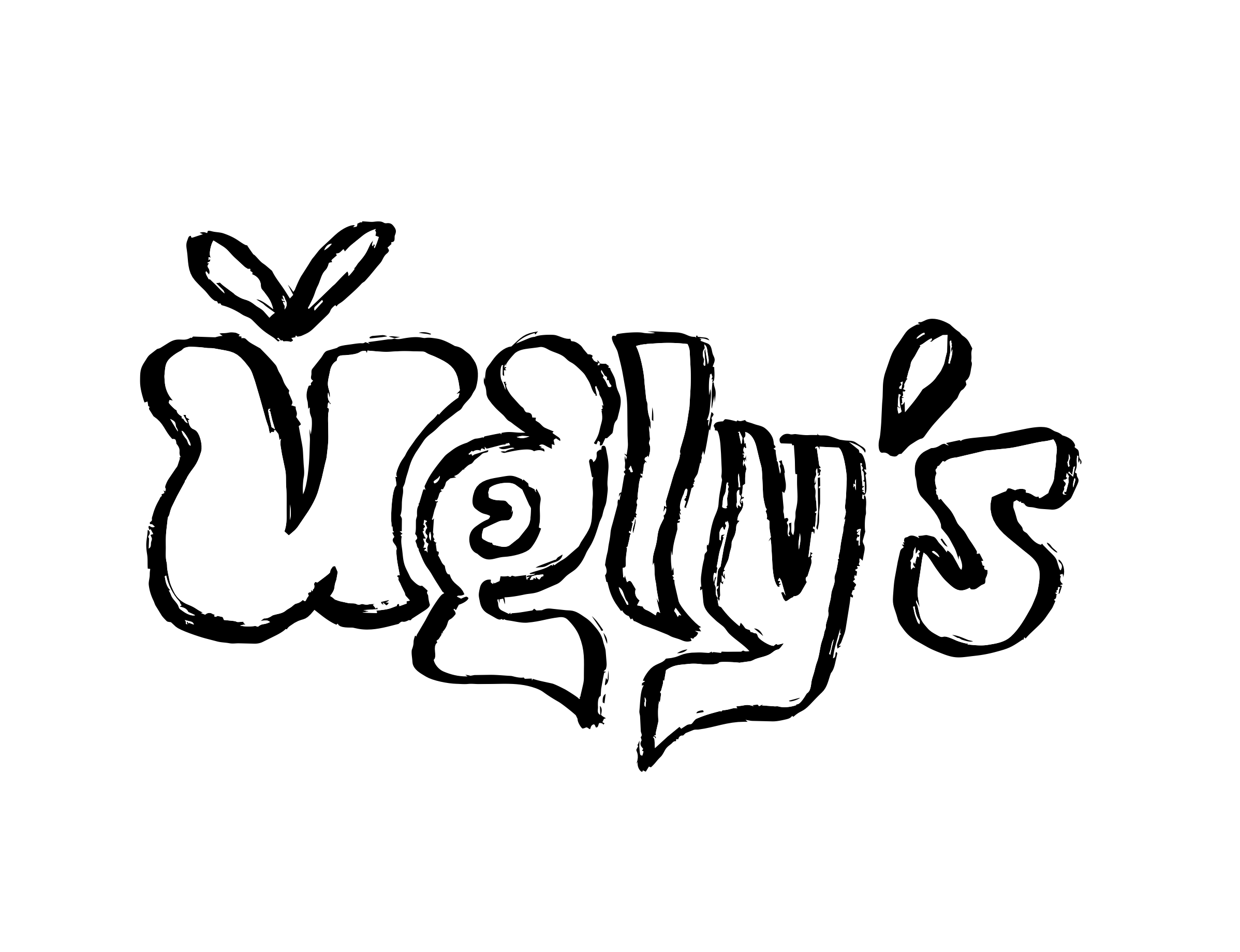
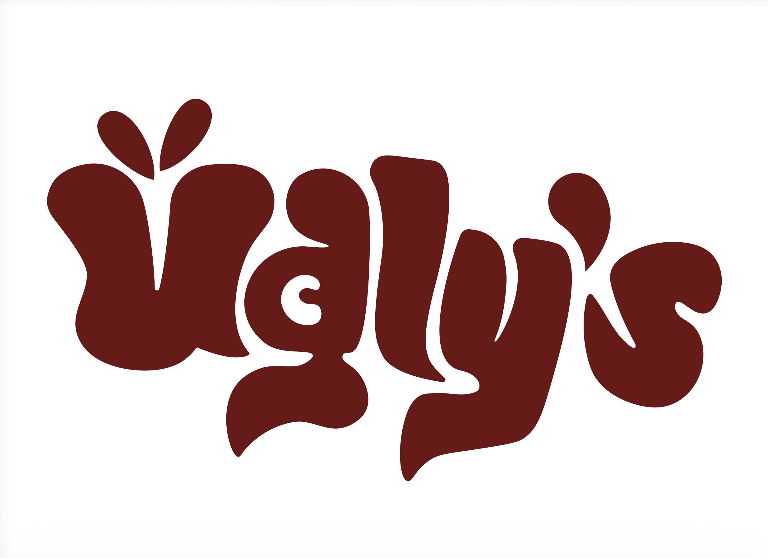
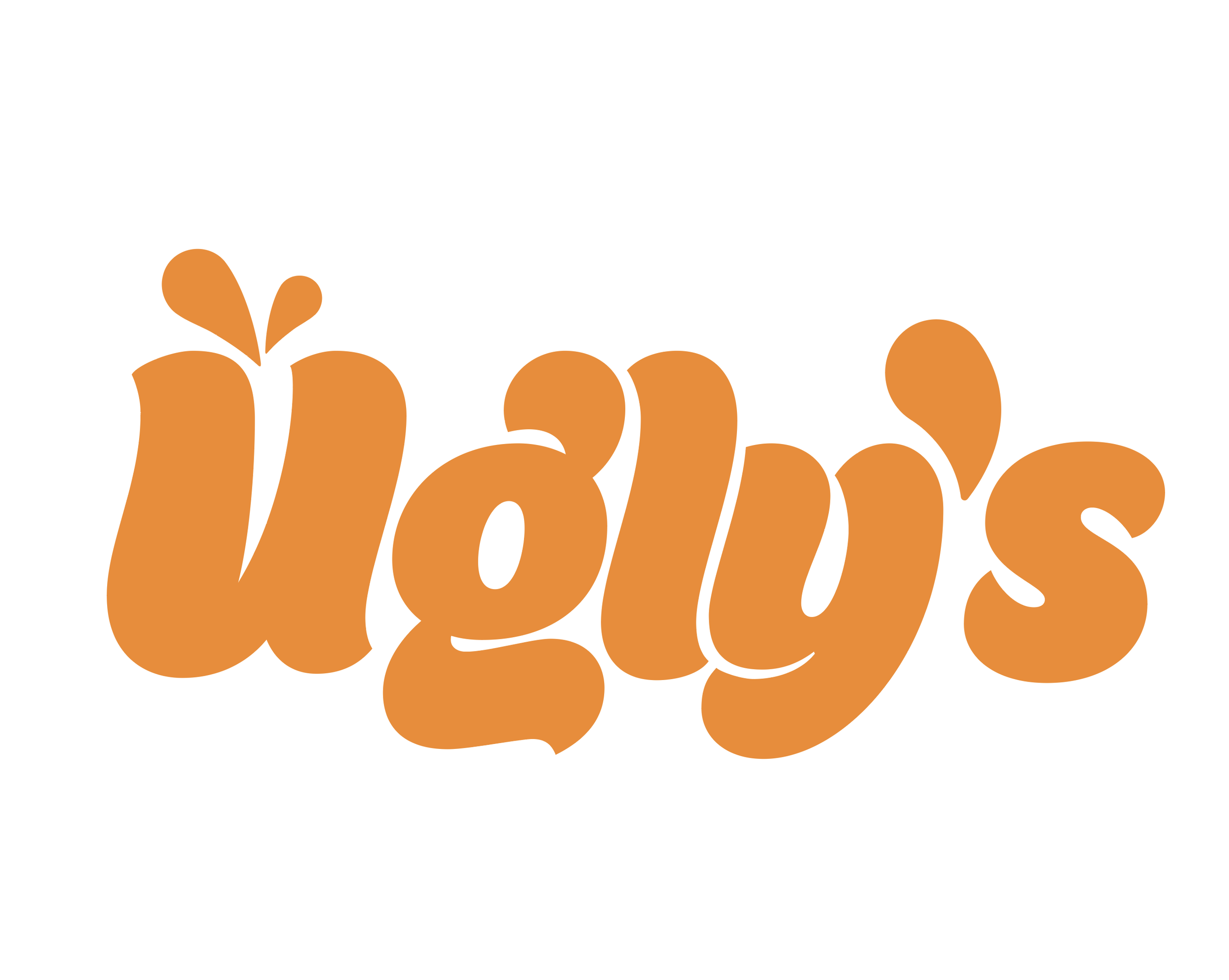
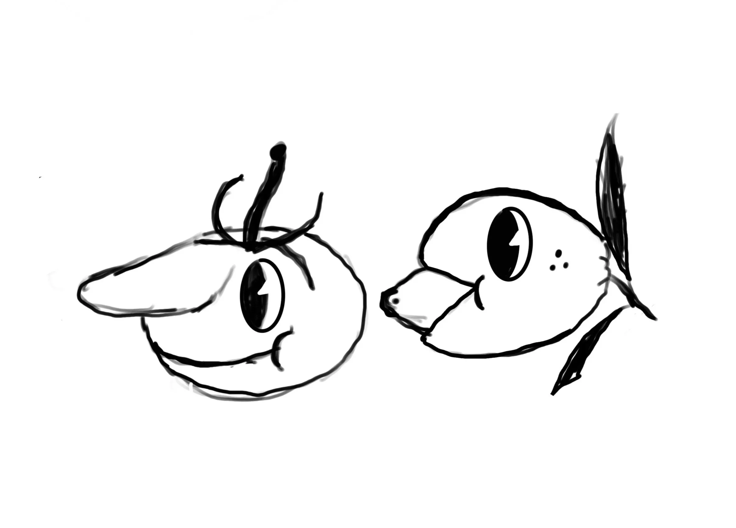
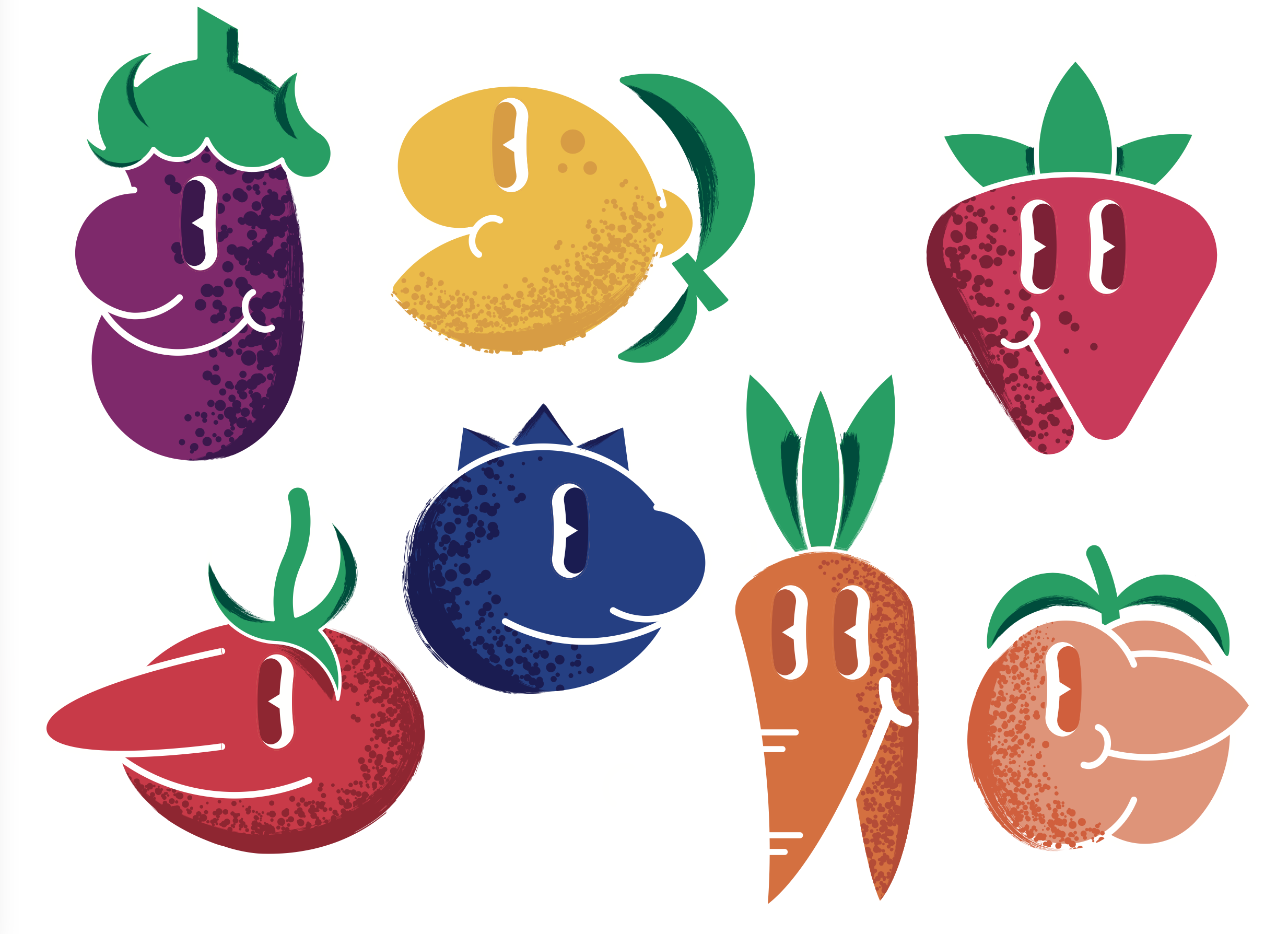
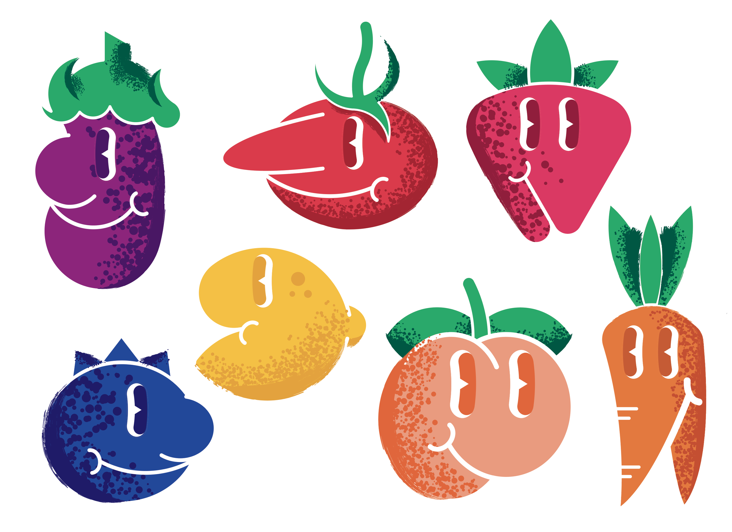
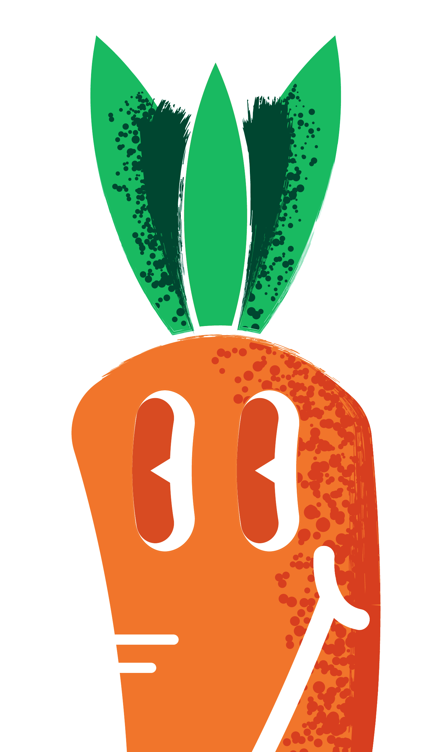
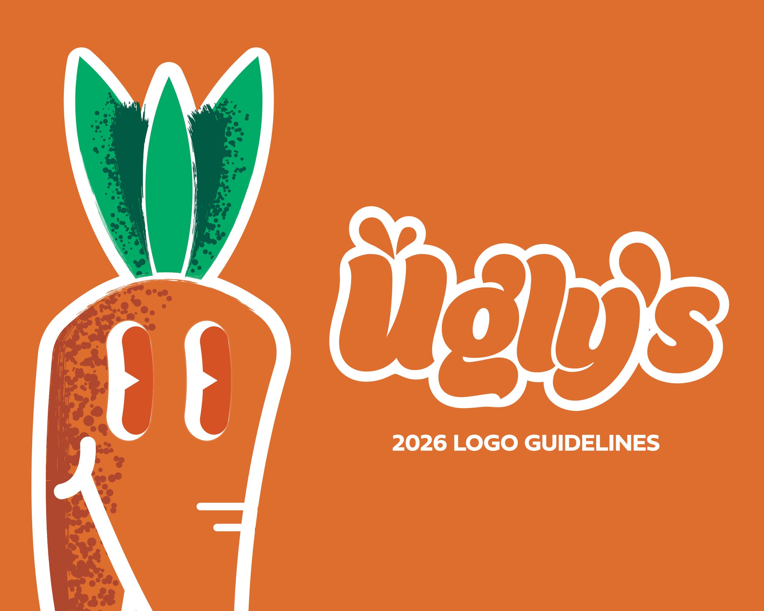
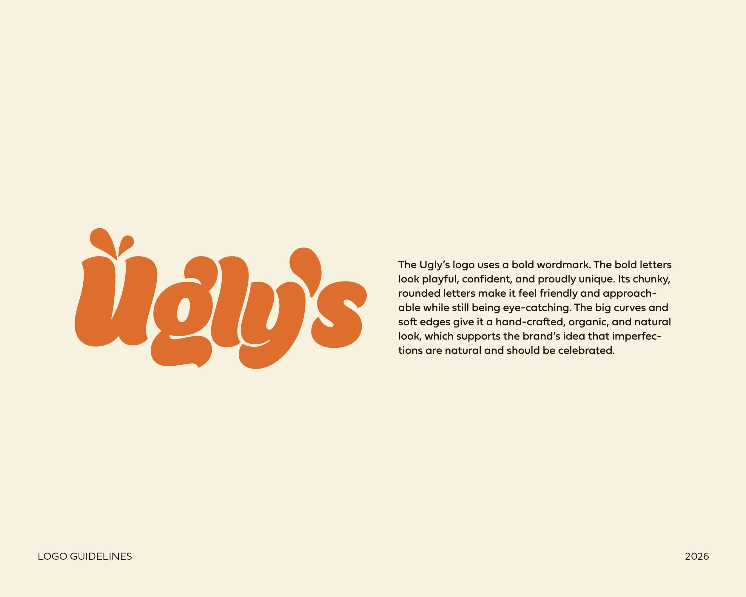
The concept of Ugly's Produce Company logo began as an effort to create a mark that represented the brand's fun, approachable nature and its core values of imperfect produce. Organic, rounded shapes were employed within the letterforms to produce a soft and slightly imperfect feel, reflecting the natural curves of fruits and vegetables. Bright orange hues were chosen for freshness and warmth, and to add a unique and bold element to stand out while staying inviting. Small additions of a droplet shape above the "U" were implemented to add life and suggest produce quality and juiciness. Ultimately, the final mark creates an identifiable and versatile brand identity with a distinct personality.
Logo Guidelines


Process Narrative
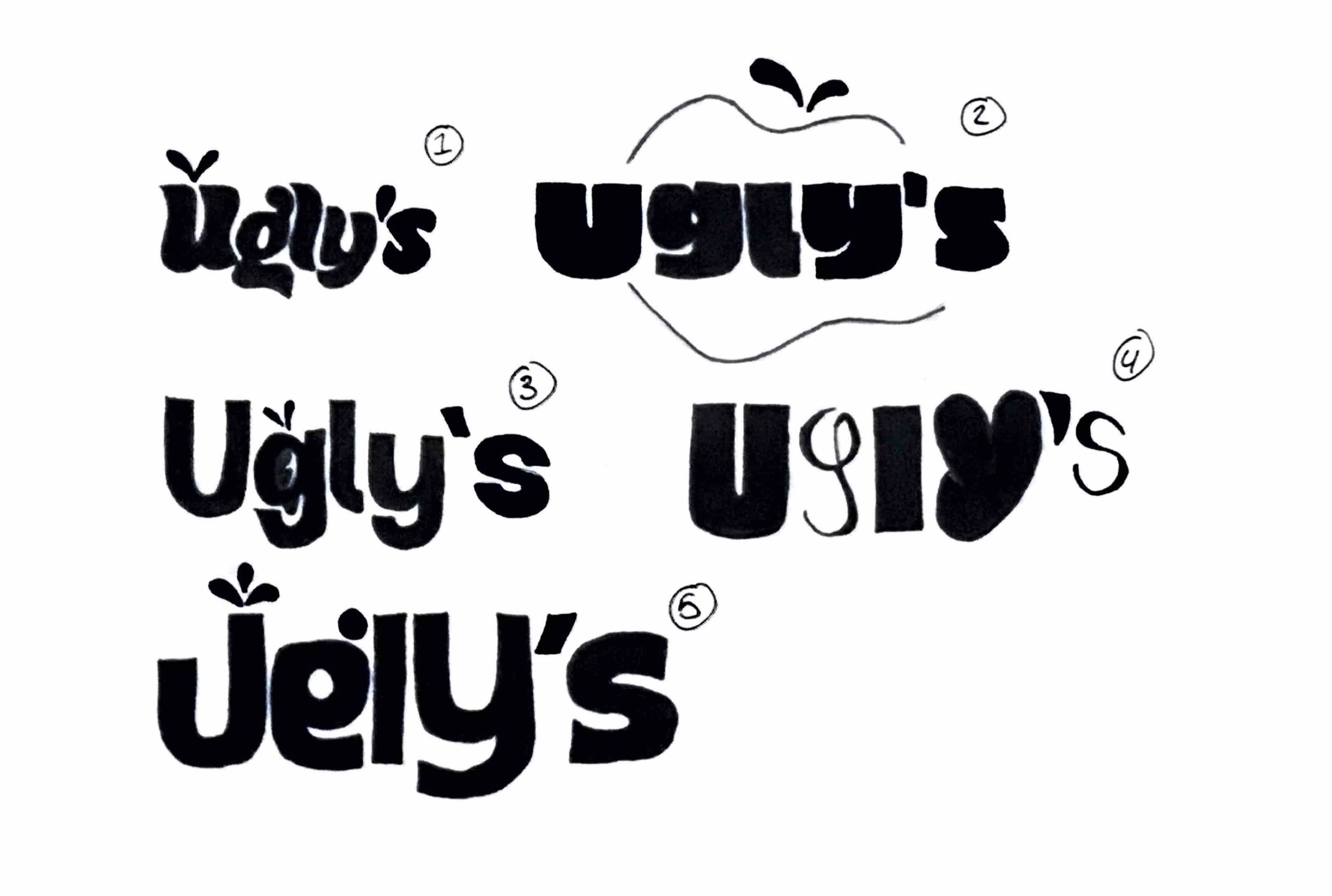
The exploration began by considering "ugly" produce from a place of positiveness instead of negativism. The initial thought process was all about sketches; whimsical, non-perfect shapes and letterforms were being drawn out and the aim was to make them feel approachable and human. Lots of thumbnail sketches were created in order to experiment with how far exaggeration, asymmetry and character can be pushed before legibility and brand recognition are affected. From here the playful, punchy and unconventional tone of Ugly's Produce could be identified.
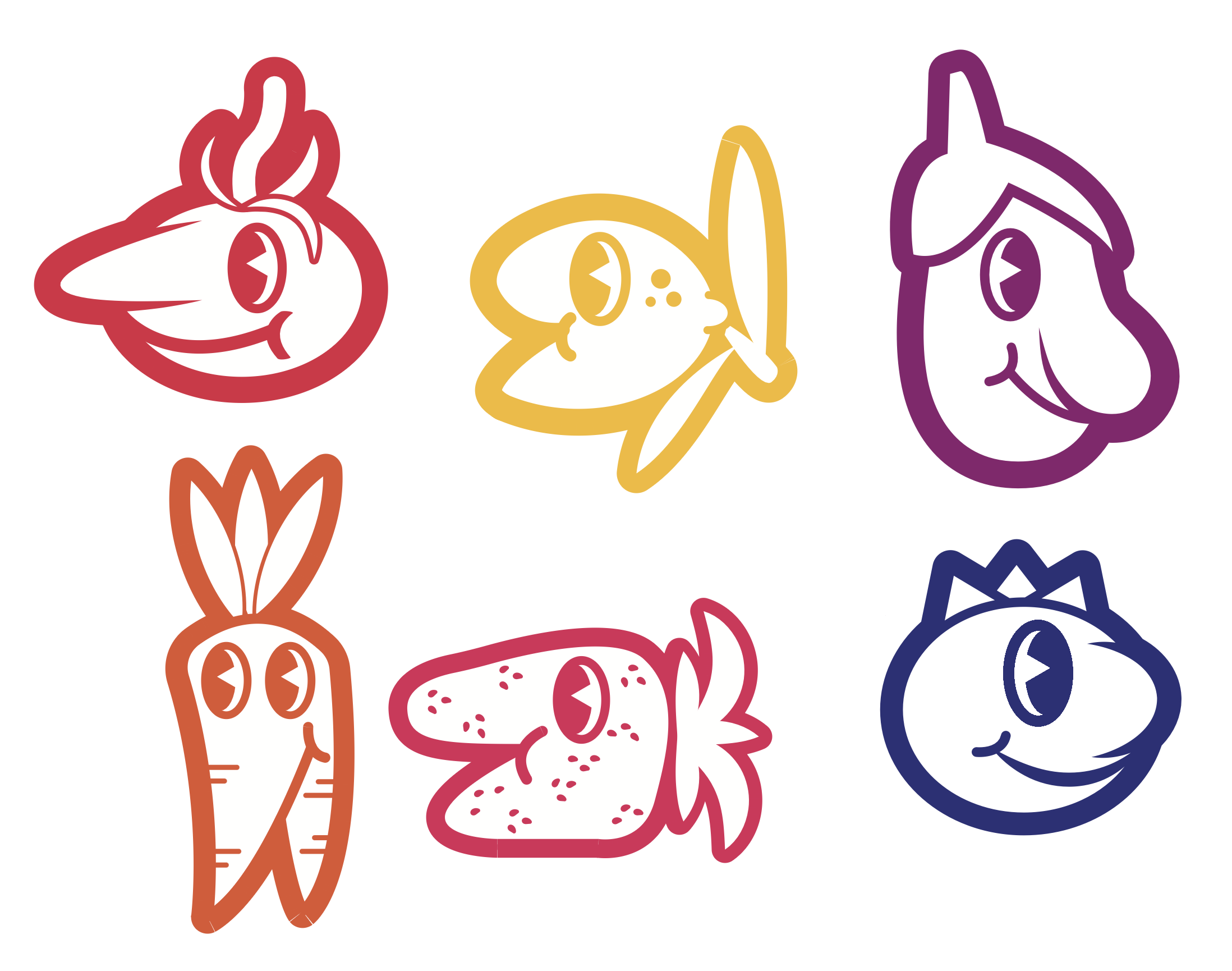
Once the strongest concepts were identified, the design was translated to digital. The logo and support graphics were honed in illustrator where emphasis was put on consistency, balance and scalability. A bespoke type was designed that feels soft, organic and slightly imperfect while also having structure and supporting the imperfect nature of the brand. The colour exploration process took place during this time which led to a lively palette based on natural produce tones but with increased colour saturation to have impact across packaging and marketing collateral.
With the core identity defined, the system was extended across applications, including packaging, stickers, posters and brand guidelines, to ensure consistency across all platforms. Mockups were produced to see how the designs performed across many contexts from grocery bags and delivery boxes. At this stage elements were adjusted to ensure legibility and consistency throughout.
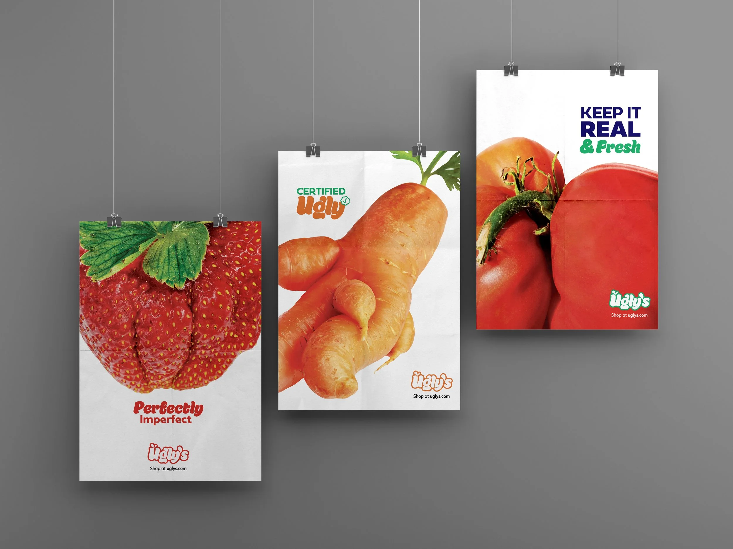
Ugly's box is hard to ignore. It's neon orange and screams at you across the room. The goofy produce drawings and bold white font are not going to hold anything back. There are some weird shapes and patterns layered in as a reminder that what they've packed inside isn't perfect, and the box actually says, "Keep it real & fresh." It's not really just a cardboard box, but a design to be proud of, standing out and being different.
Research Synopsis
For Ugly's Produce, research was critical in its rebrand. I first analyzed the market for imperfect produce and sustainable grocery brands and how other brands presented "ugly" produce through their tone, messaging, and visual design. I reviewed competitor brands and how they approach branding, packaging, and sustainability claims, in order to discover what makes Ugly's' rebrand stand out among them. I observed how humor, distinctive visuals, and transparency can be used effectively.
Visual research had a large influence on the design direction. I researched current design trends for modern packaging, playful typography, and colorful schemes, especially ones that resonate with a younger audience. Looking at sites like Pinterest and design presentations gave me a range of styles and ideas that balances whimsy and clarity. Additionally, I studied illustration styles and character-based branding, in order to create vivid and charming product graphics that emphasize individuality, while still being positive.
I also conducted real-world research looking at items such as grocery packaging, shipping containers, and promotional items to ensure the rebrand was comprehensive. Using current produce labels and retail environment as inspiration allowed me to establish layouts, information priorities, and design goals for packaging and other branding materials. The rules for logo usage, color selection, and brand items like tote bags and stickers were derived from this research. By drawing from both market research and visual studies, the rebrand system for Ugly's Produce is comprehensive, relatable, and unforgettable.
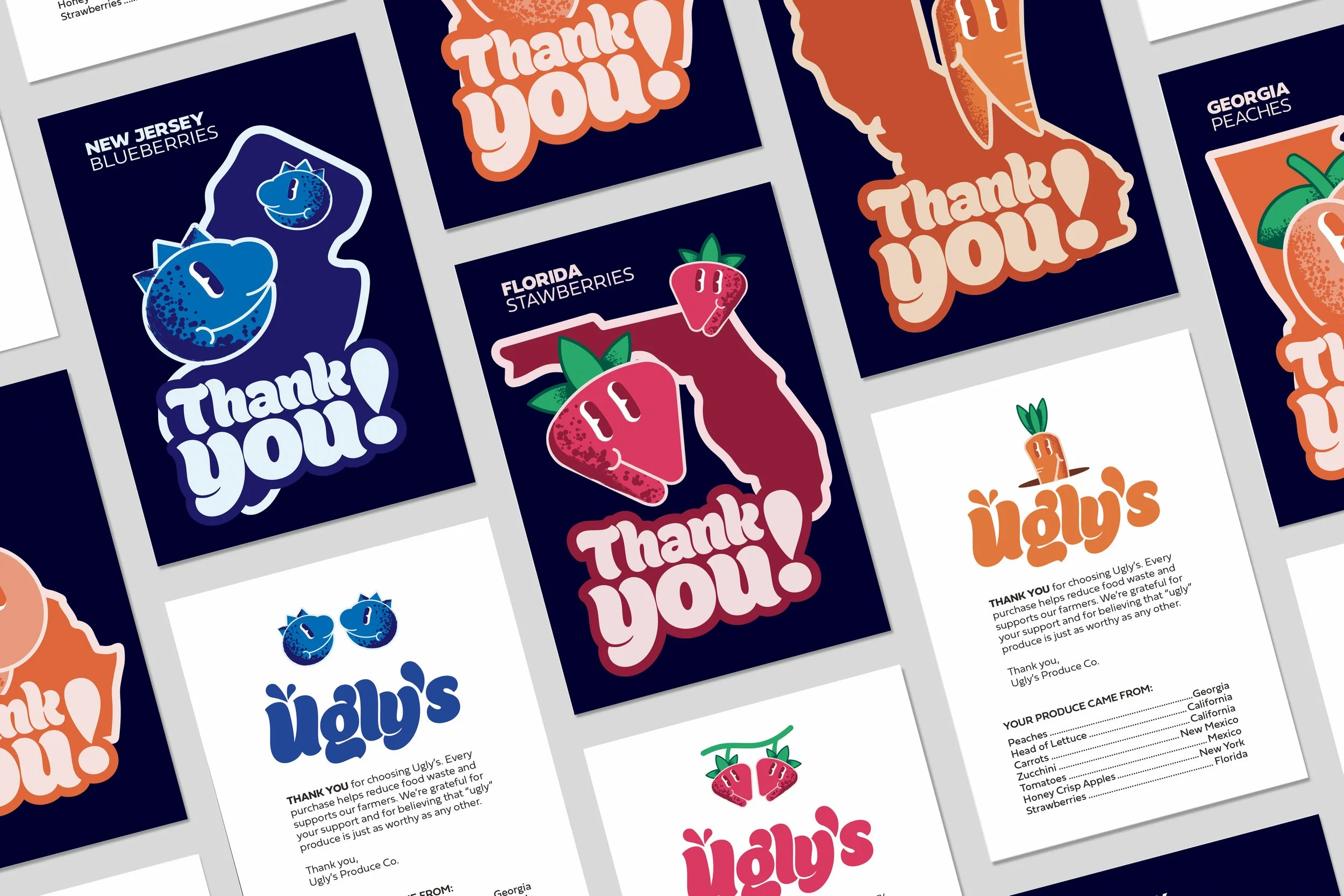
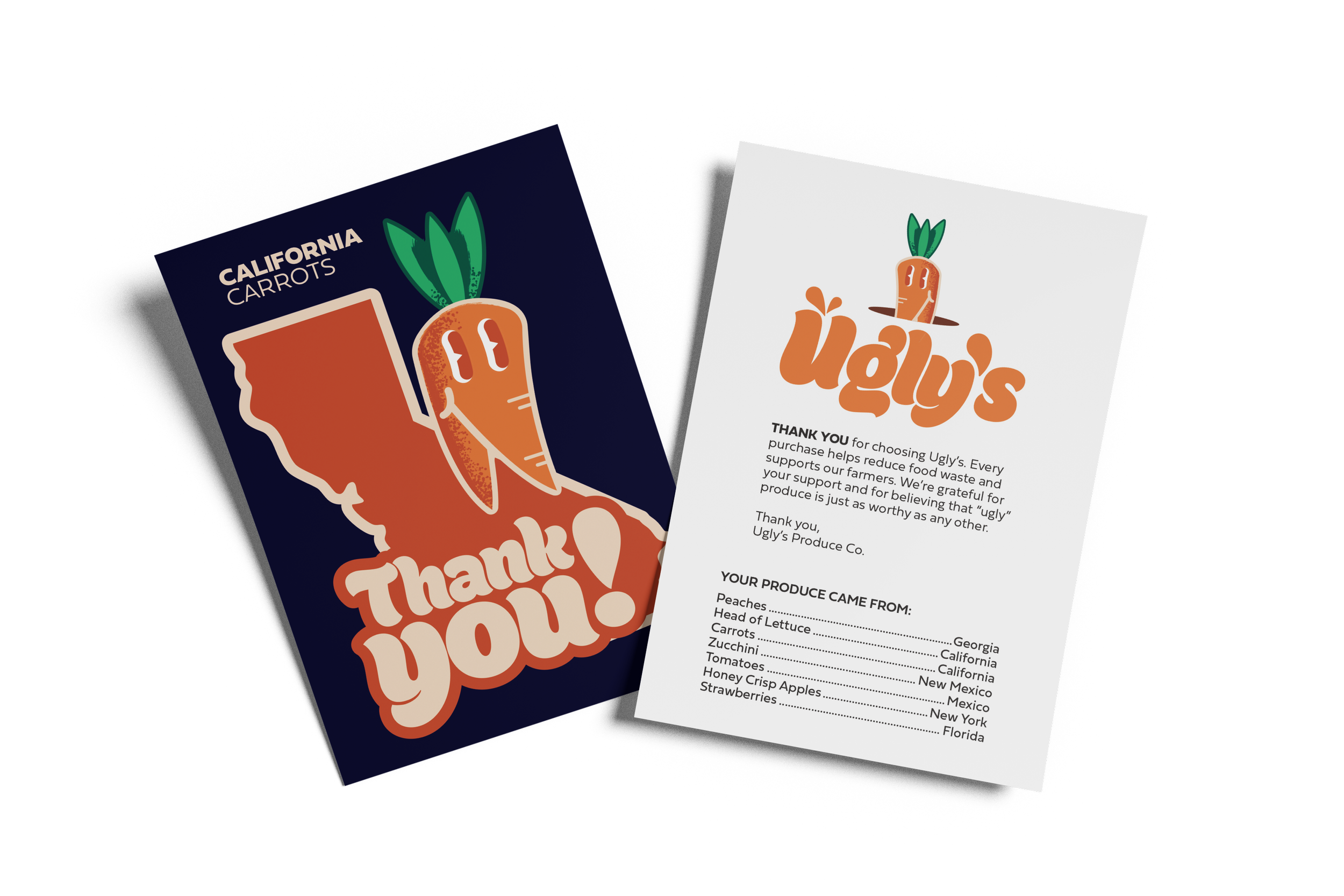
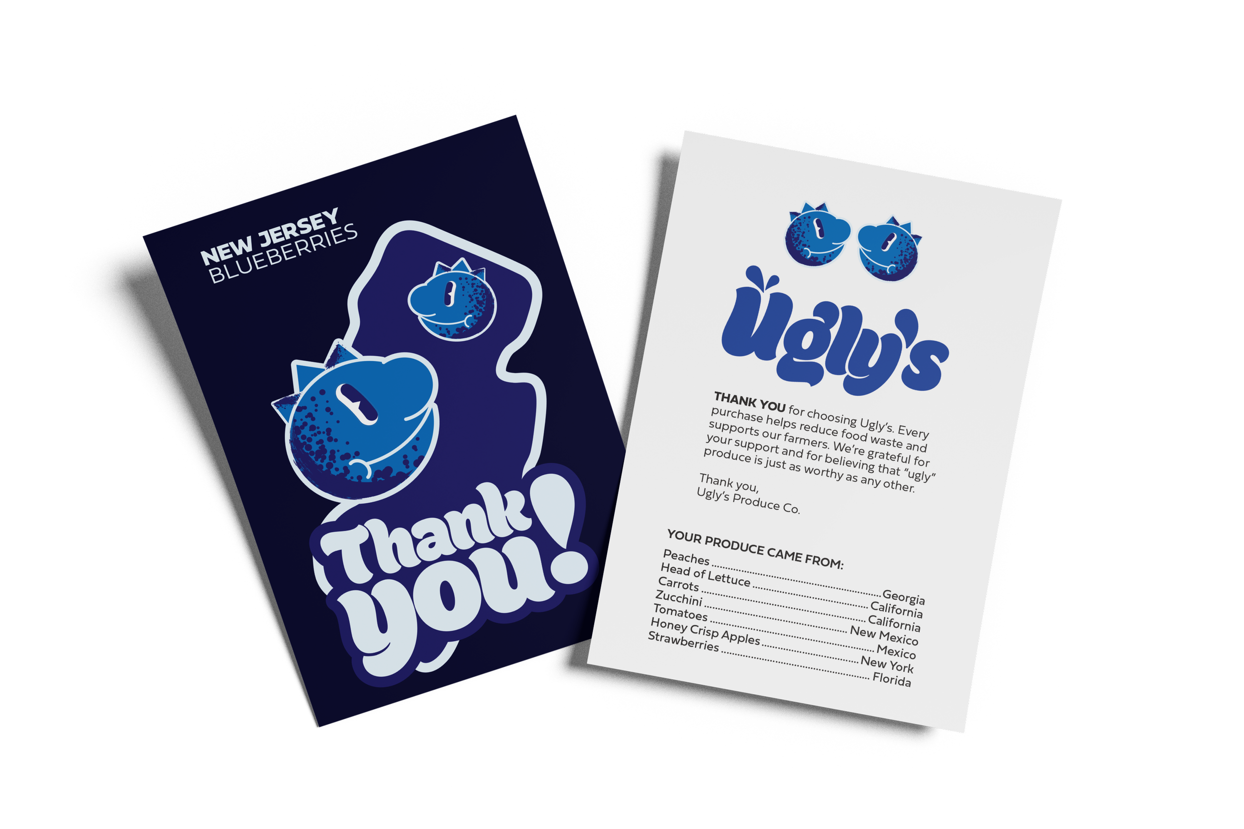
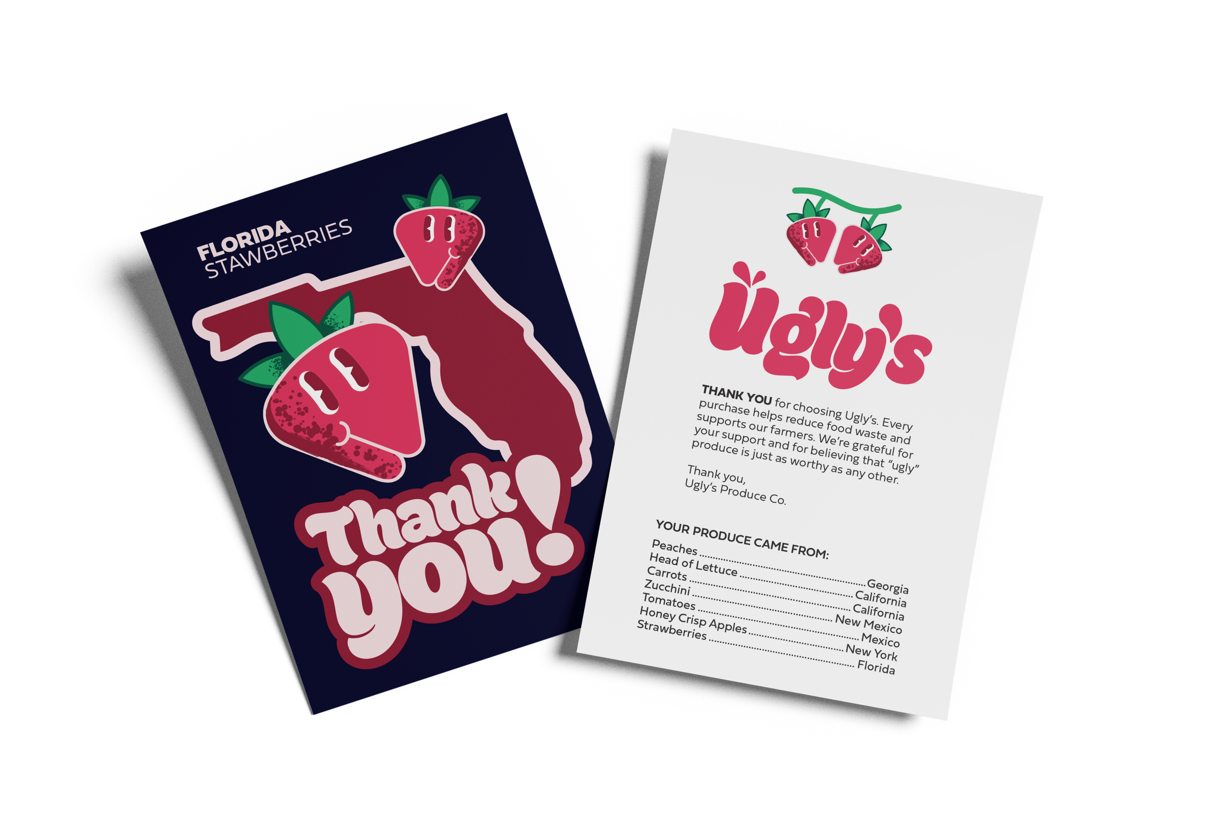
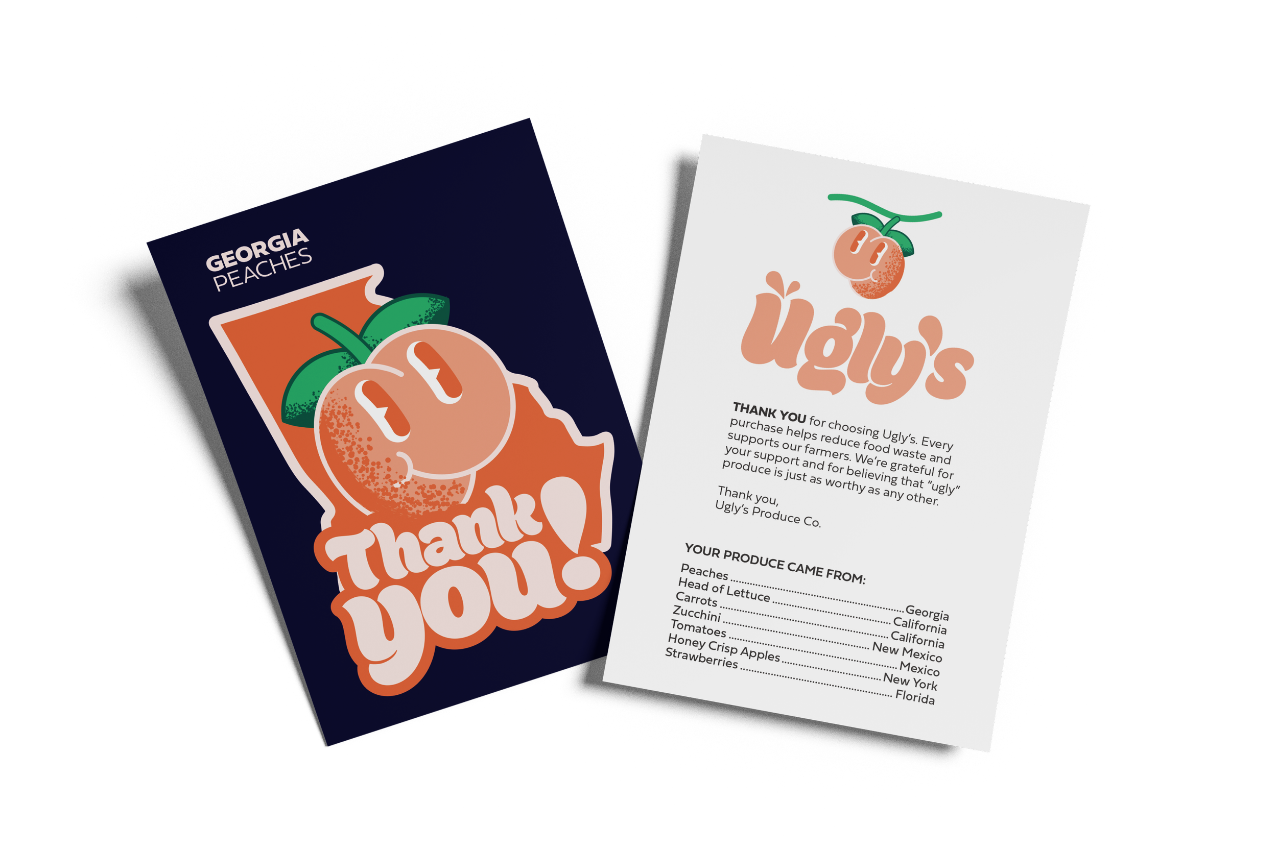
Shipping Box & Thank You Card
Ugly's Produce Thank You cards are designed to create an enjoyable and lasting impression on the consumer by combining playful, bold colors with friendly fonts and colorful produce illustrations. Every card displays a unique fruit or vegetable in a whimsical, slightly irregular fashion, which reinforces the brand's emphasis on embracing imperfections. The vivid, contrasting color palette and friendly "Thank You!" statement create a positive and personal feel, while a consistent template and branding help to hold each design together. These designs translate a simple thank you note into a real embodiment of Ugly's fun, kooky, and authentic brand.
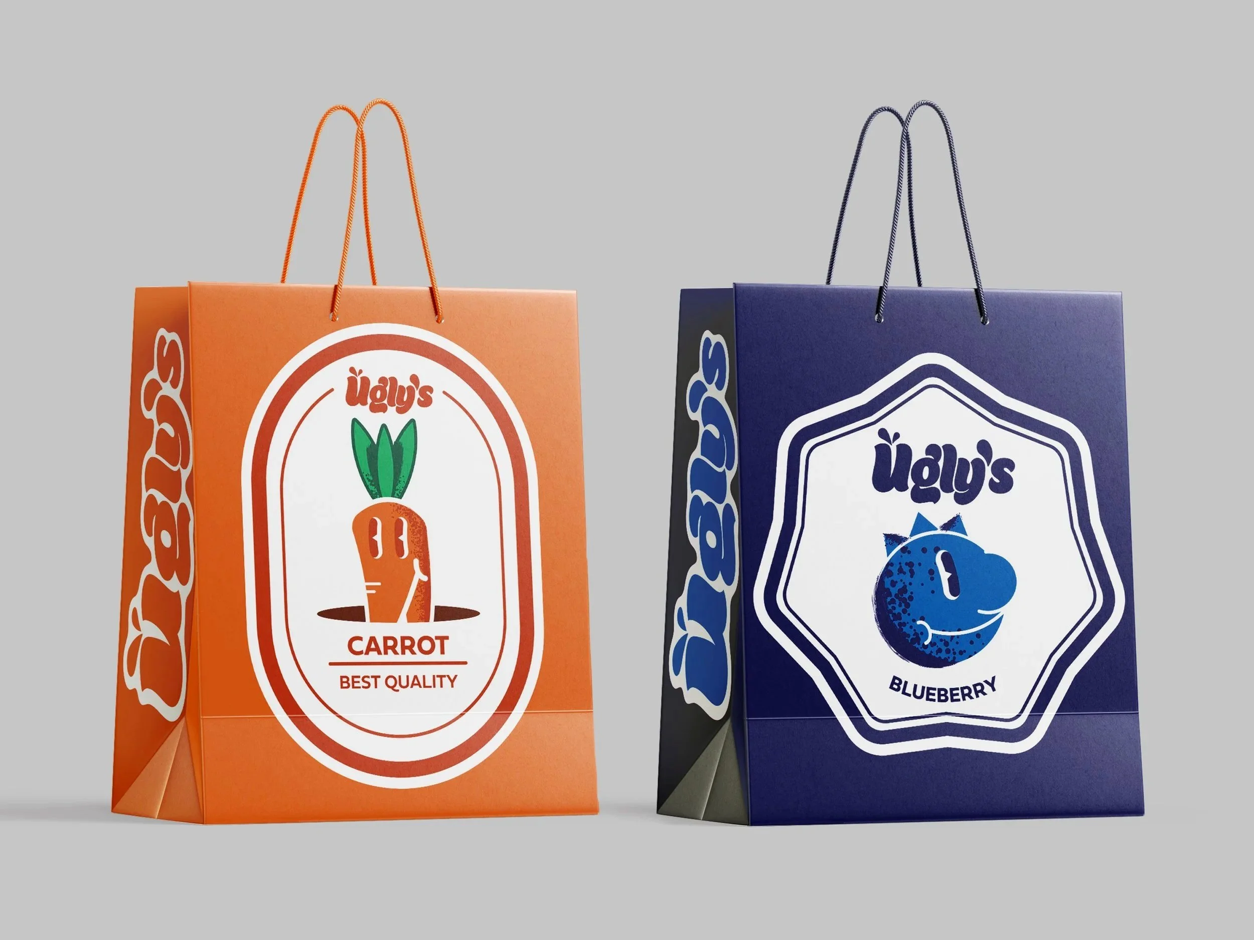
Grocery Shopping Bag
The bags are a really good and noticeable part of Ugly's Produce brand. Bright, graphic, and not at all boring, they add an elevated twist to standard packaging. I think they did this by emphasizing bright, playful images of the produce, by creating a style that's almost like collectible stickers to demonstrate each product, and by using colors that pop. I also think the slight asymmetry of the layouts enhances the message of "ugly produce is good produce." Overall, the bags have successfully transformed a mundane purchase into a branded element of its story, in addition to all the sustainability factors.
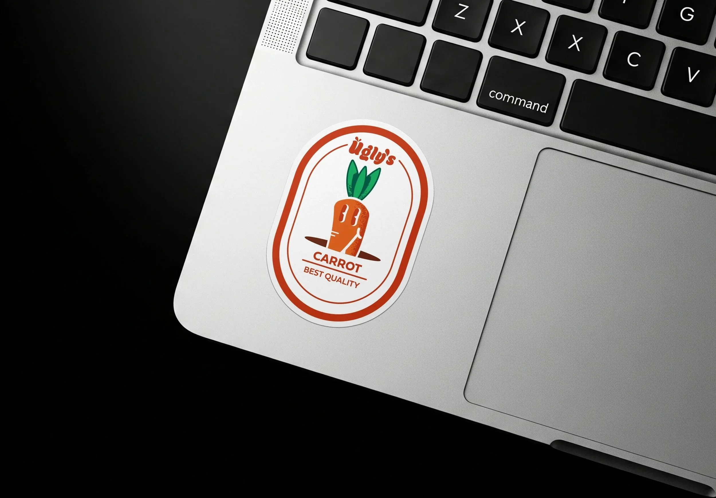
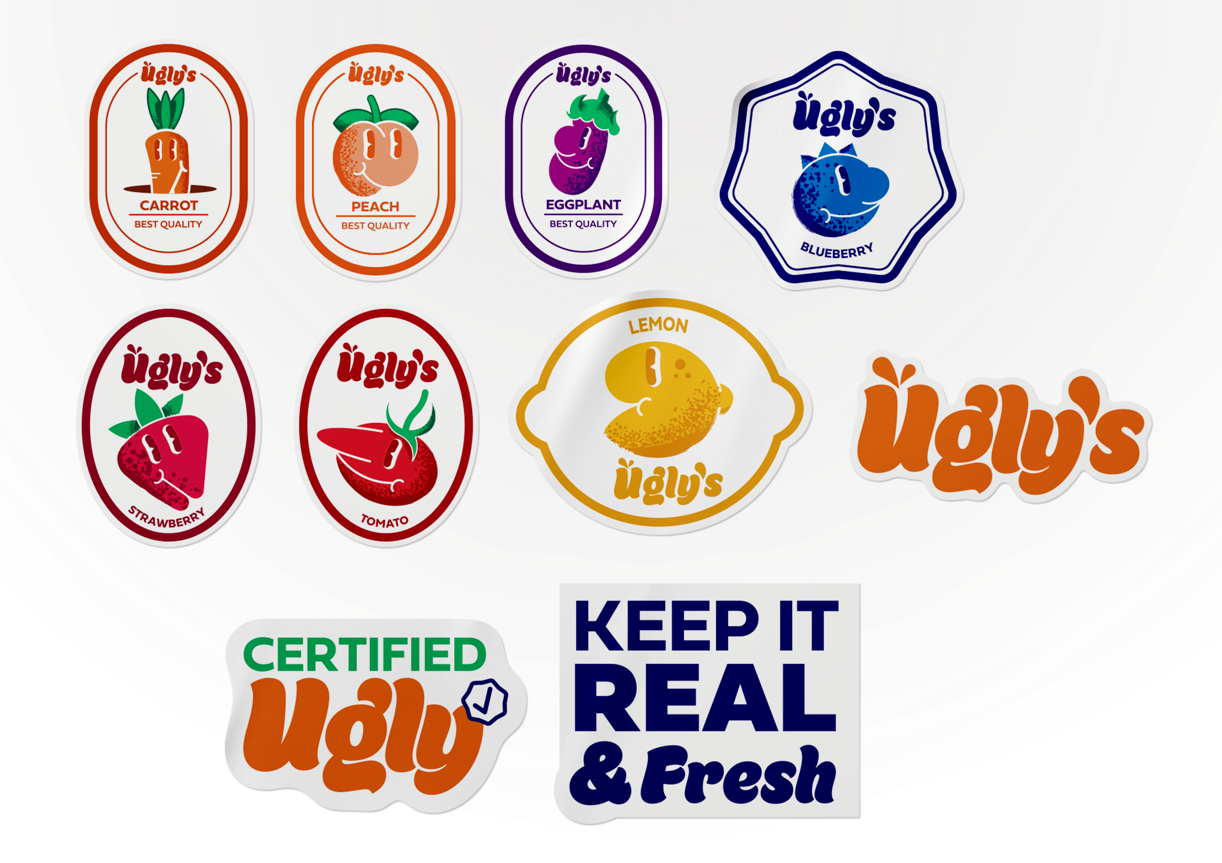
Stickers
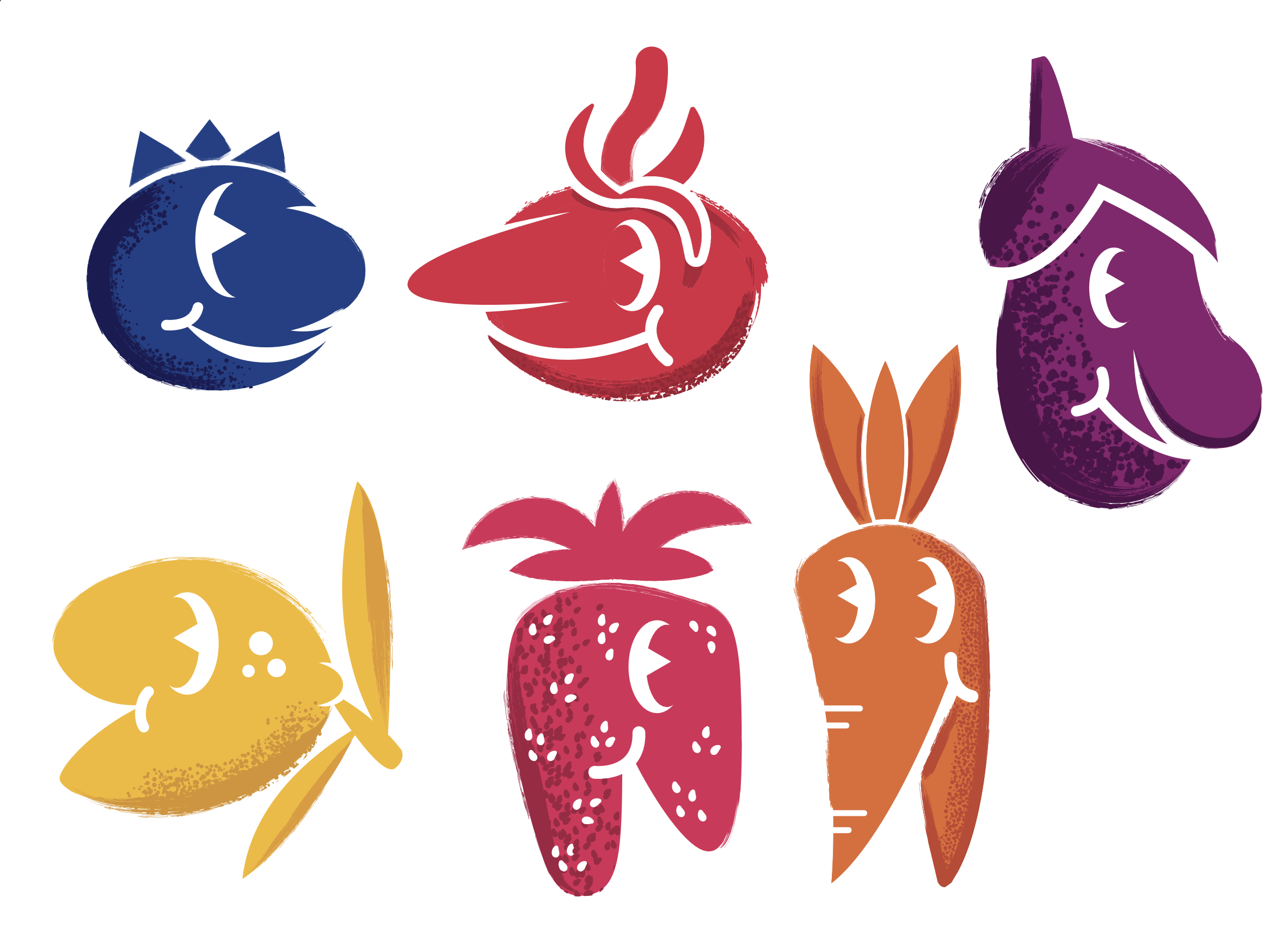
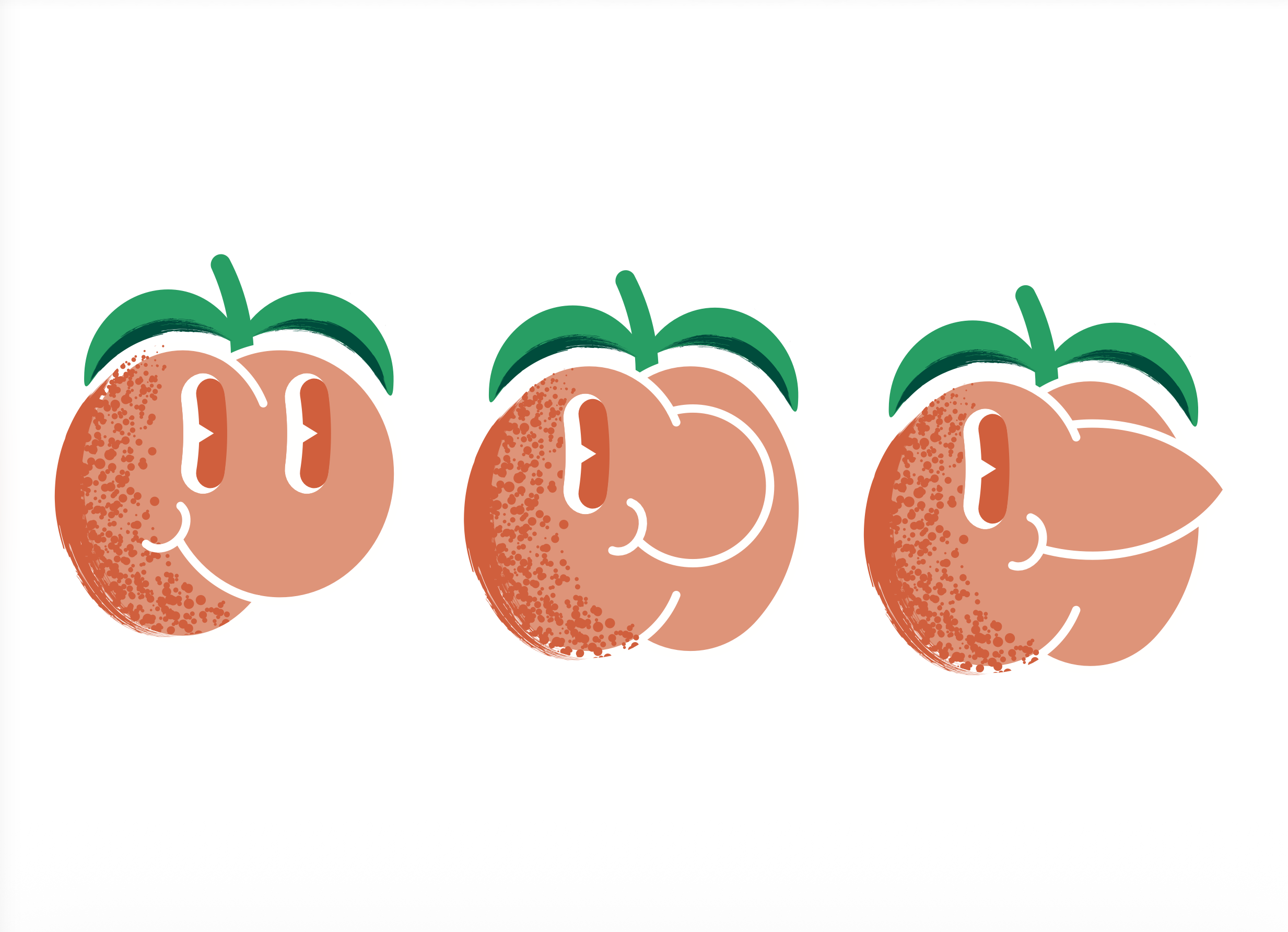
Ugly's Produce label design incorporates thick and fun illustration styles that translate imperfect produce into fun, illustrated characters. Each sticker is bright with bold and full color and fat outlines, and characters whose forms express the "ugly but lovable" idea. While each sticker's design changes slightly from the others in each pack, they share the same typography and color palette that uses a large orange as a base for all branding.
Poster Ads
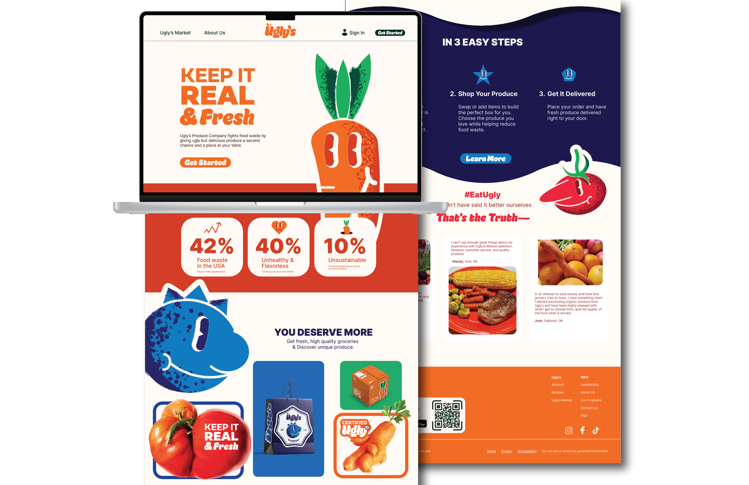
Ugly's Produce website brings the brand's loud and fun style to a tidy, user-friendly online experience. Vivid colors, large text, and fruit illustrations are consistent with their branding and packaging. The overall design is tidy yet playful and is clearly organized with clear pathways to view their products, their sustainability information, and the brand story. The "imperfect but delicious" angle of Ugly's Produce is celebrated, and the overall feel is both approachable and memorable for their shoppers.
Website
Initial brainstorming was to define the idea of 'ugly produce' in a more positive light, rather than being inherently bad. The early brainstorming was mostly sketching and testing of whimsical, uneven shapes and lettering that felt accessible and humane. A large variety of thumbnails were created in order to see how far exaggeration, asymmetry and character could be pushed while still being legible and maintaining brand identity. This stage helped set the tone as humorous, assertive and a little quirky.